As a young, small business that just celebrated our 5-year anniversary, Rob and I have had the pleasure of experiencing several important “firsts”. Our first client, first hire, and first equipment purchase are just a few that come to mind. And while there have been plenty of firsts that involved the struggles of business development or hurdles with certain productions, all of our first experiences have helped shape our company’s vision and decision making ability. Those experiences helped us to determine the best ways to approach a project and execute our plan to deliver the results our clients are looking for, each and every time. Our latest “first” was very memorable because it was something Rob and I never experienced in our time at Temple University or even thought we were capable of pulling off.
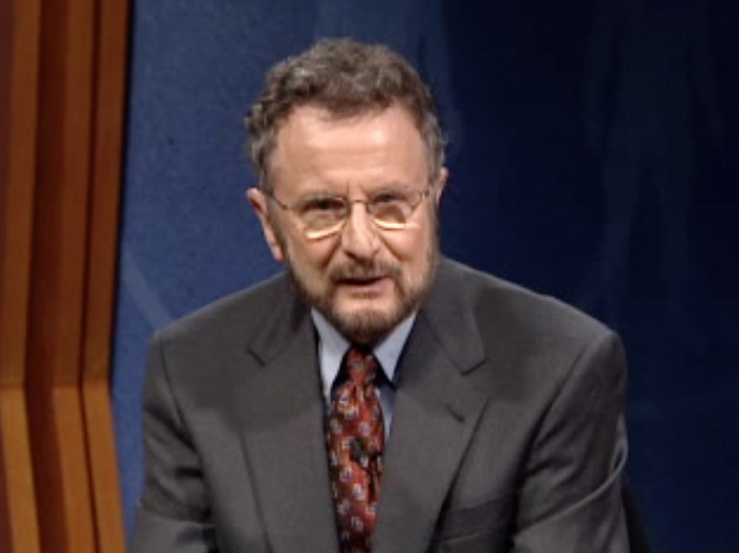
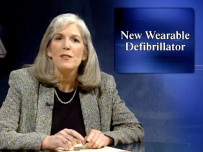
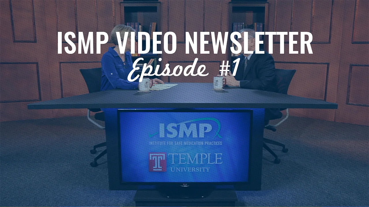
In the spring we were tasked with producing a unique video series that saw a partnership between Temple University’s School of Pharmacy and the Institute for Safe Medication Practices, the nation’s only non-profit organization devoted entirely to preventing medication errors. This video newsletter series would be delivered to the inboxes of nearly every hospital and pharmacy in the country, providing updates on the most urgent safety matters in the healthcare industries, while bringing recommendations from the country’s leading experts in patient safety issues.
THE CONCEPT
Our concept for the project was inspired by a series the FDA produced in the 1990s and 2000s and involved a news desk setting where a host would present viewers with a topic overview before interviewing experts in a multi-camera talkback style segment.
This wasn’t anything Rob and I hadn’t done before in our college days at Temple Update and Temple University Television ♥. However, one important aspect of our concept we initially overlooked was arguably the most prominent part of the video series, the design of the set. In all of our prior productions with clients like The Children’s Hospital of Philadelphia, American Heart Association and One Liberty Observation Deck, we had always shot on-location at the client's venue or in some public space. So envisioning a structure, purchasing materials and actually executing the build was a daunting task that was complicated by a tight deadline and project budget as well.
Like any small business owner however, we used our network of family, friends and mentors to gather as much knowledge as we could and were able to recruit a handyman in my father, Chris, to help us determine the specific materials and hardware to purchase along with providing us a rent-free workshop. From that point we were off! During development we set out to build the following:
(8) 4’x’8’ Wood Panel Flats
(8) Right Angle Panel Supports
(2) Bookcases
(1) News Desk
(1) TV Stand
(1) Carpet Floor Covering
THE BUILD
After viewing a number of online tutorials and posts, especially from James McKernan, we had step-by-step instructions for building the flats, which would be the most time consuming part of the build. You can’t exactly just go into an IKEA and buy panels that resemble the walls of a professional office setting. From cutting a large amount of a 1x3” studs, to mounting the wood panels to the front of the frames and then sanding and staining every visible inch of wood, it was a long and meticulous process.
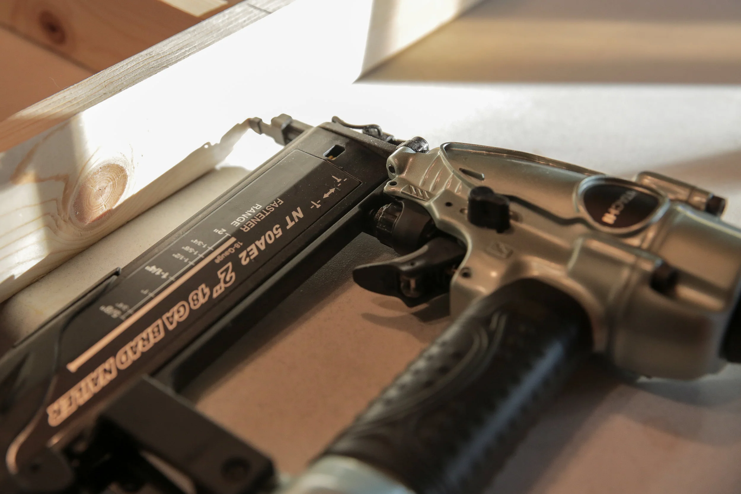
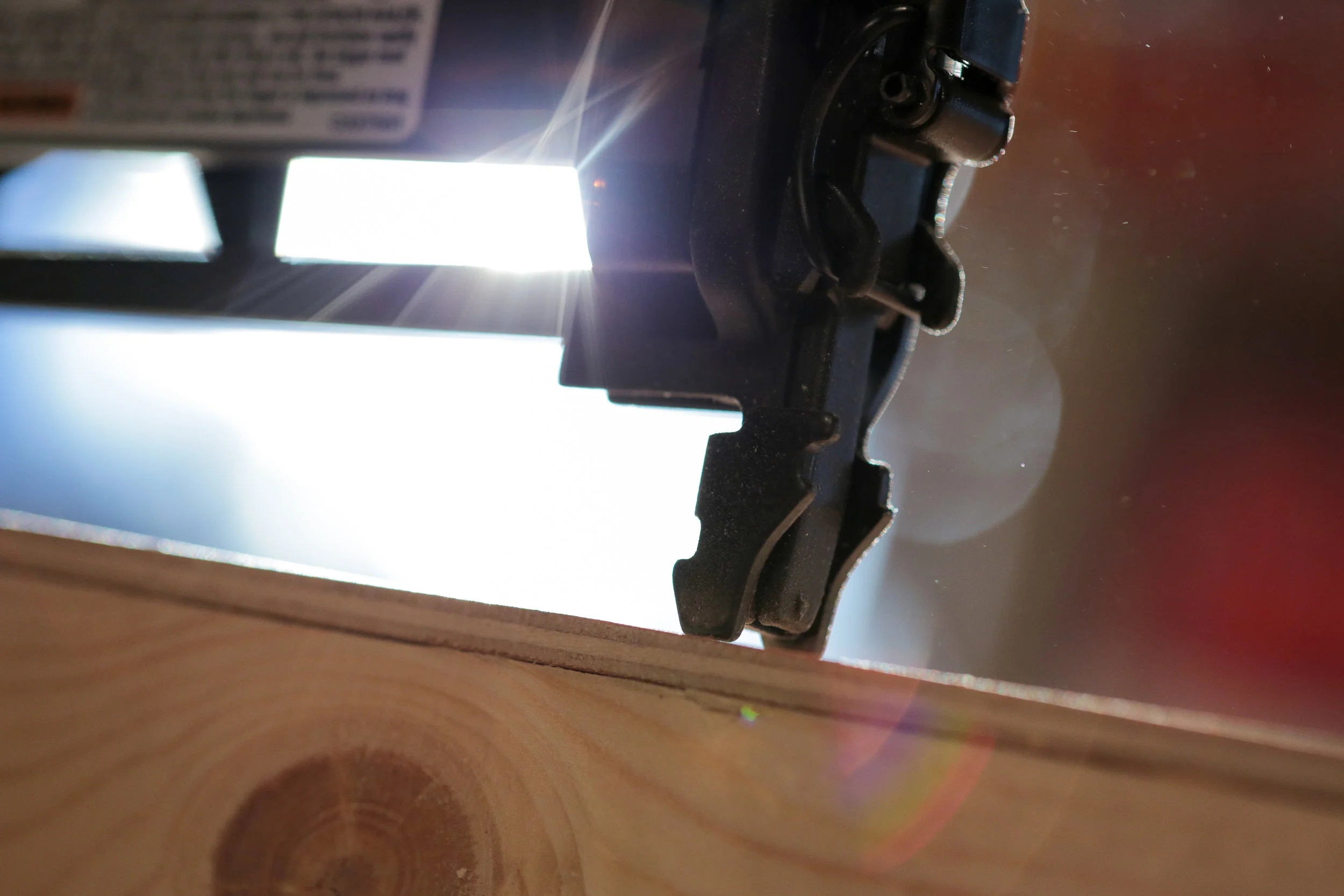
However, a really dangerously neat aspect of the build was using a pneumatic nail and staple gun, which saved a significant amount of time and elbow grease for all of us. While I grew up in a largely rural area of Berks County where horse and buggies were pretty common to see, for nearly the past decade I have been living in Philadelphia sitting at a computer or standing behind a camera. So it was definitely a little nostalgic to be back at my childhood home in the same workshop where we built birdhouses and toolboxes from scrap wood for Boy Scouts.
After the panels were completed and bolted together, the last big build was the news desk. Going into the build we knew we had to scale back the design of the desk because we just didn’t have the space and knowledge to build a local news quality centerpiece. Cutting wood on a straight line between Point A and Point B is one thing, but adding in a modern curved façade, multi-layered trim and glass insert into the design was just not in the cards for this project. So we knew our limits, but were still able to design a simple, professional looking piece that met our needs for two people to interact, while also being large enough to accommodate up to four people at one time, which could prove useful for future shoots.
To bring our black matte desk into the 21st century, we decided to have a large LED monitor sit on a riser to display client branding for the production. Furthermore, we wanted to add a little bit of colored light to draw some attention to the front of the desk. By adding a few blue gels, we wrapped two dimmable LED lights and installed them underneath the tabletop to back-light the TV and increase the overall look of the set.
From that point on we built the remaining pieces that included the panel supports, IKEA wall-mounted bookcases (a time consuming project in it’s own) and found carpet floor covering while sparing a little time to add our own branding.
Making our mark. Setting up for a fun shoot this week! 2️⃣0️⃣2️⃣0️⃣ pic.twitter.com/uUpgZKuMEo
— 20/20 Visual Media (@2020VisualMedia) March 2, 2016
THE FINAL PRODUCT
Using the better part of three 12-hour days to build everything was a very large endeavor for our entire team. In the end the client was very happy with the set and Episode #1. We’re all looking forward to future shoots with the School of Pharmacy and ISMP after having a successful set building “first”.
Enjoyed following the construction process? Get social with us and follow along our next set design building project with our newest client Crayola 🖍! We'll be producing product demo videos in a studio-constructed bedroom setting.


